How to Design Better AI Apps with Medo UI Enhancer (No Design Skills Needed)
Introduction
When building apps with AI, a pattern quickly becomes clear.The issue is rarely functionality. It is almost always the interface. Most AI-generated apps are technically usable, but visually they tend to feel generic, lack clear hierarchy, and fail to convey any real sense of product identity. As a result, they often come across as demos rather than production-ready products. MeDo UI Enhancer addresses this at a more fundamental level. Instead of focusing on how to design, it helps define what the interface should look like from the start, allowing AI-generated apps to feel more aligned with real-world product standards.
Key Takeaways
- MeDo UI Enhancer introduces 17 UI styles
- Each style maps to a specific product scenario
- UI styles help AI generate more structured interfaces
- The right style choice makes apps feel closer to production-ready products
- UI style selection is a key factor in improving design quality
How to Use MeDo UI Enhancer Effectively
The logic behind using MeDo UI Enhancer is actually quite simple.
Step 1: Identify the Product Type
Start by understanding what kind of product it is.
Is it product-focused, brand-driven, emotion-driven, or theme-based?
Step 2: Choose the Right Style
Match the style to the scenario:
- SaaS → Minimal
- Beauty → Macaron
- Industrial systems → Blueprint
- Developer tools → Terminal
Step 3: Describe the Scenario Clearly
Instead of saying “make it look better,” define the context:
- What is the page type
- What are the content modules
- What kind of feeling should it convey
This helps AI avoid falling back into generic templates and produce a more context-aware interface.
Breaking Down MeDo’s 17 UI Styles
To make things easier to understand, MeDo’s 17 UI styles can be grouped into four categories:
- Business & Product UI
- Creative & Branding UI
- Emotional & Lifestyle UI
- Niche & Thematic UI
In the following sections, we will go through each group one by one, with examples and prompts to show how they work in real scenarios.
Business & Product UI
This group is designed for real product scenarios, such as SaaS platforms, dashboards, productivity tools, and enterprise systems.What they have in common is a focus on clarity, reliability, and long-term usability.
Minimal
Minimal works best for SaaS products, company websites, admin panels, and productivity tools where clarity and information structure matter most.Its core value is simple. It brings attention back to the content itself, helping users find what they need faster.For products that need to build a sense of professionalism and trust over time, Minimal is often the safest and most practical choice.
Prompt:
Design a project management web app dashboard that includes project progress cards, a team member list, a task list, and data visualization charts. Use generous whitespace, a card-based layout, and clear information hierarchy. Keep the interface clean and minimal, focusing on content and usability.
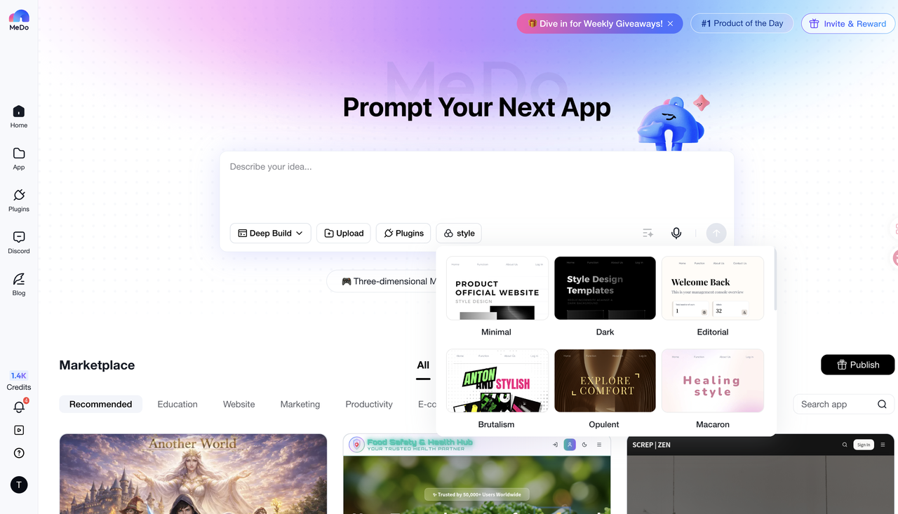
Entered the prompt on the MeDo website and selected the "Minimal" style, as shown in the image below:
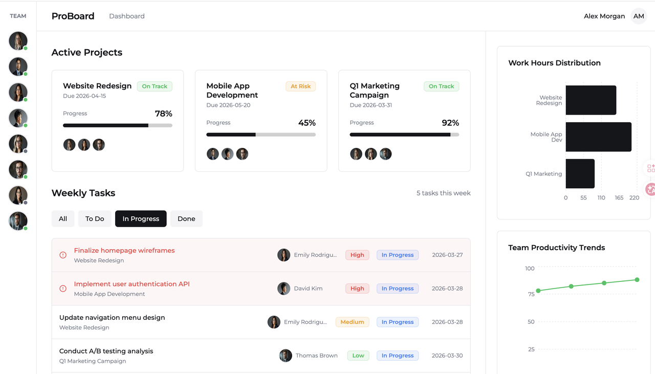
The generated interface uses a light background and minimal layout, focusing on efficient information delivery. Whitespace, subtle lines, and low-contrast colors create a clean and restrained look. A clear structure and card-based layout make content easy to scan, while minimal decoration keeps attention to the data. This style is ideal for productivity tools and dashboards, offering strong readability for long-term use.
Dark
Best suited for data platforms, developer tools, and content-heavy dashboards, especially in scenarios that require long screen time. A dark background creates a stronger sense of focus and makes dense information easier to process. It’s ideal for products aiming for a professional, immersive, and calm visual tone.
Prompt:
Create a premium black portfolio landing page with a GSAP ScrollTrigger 3D scroll animation where 15 metallic black cards move from bottom-left to top-right along a curved Bezier path with staggered timing, 3D rotation, and depth. Use DM Sans and Syne typography, a static hero title "THE DARK KNIGHT", subtle parallax, metallic hover effects, and ensure smooth responsive performance.
Entered the prompt on the MeDo website and selected the "Dark" style, as shown in the image below:
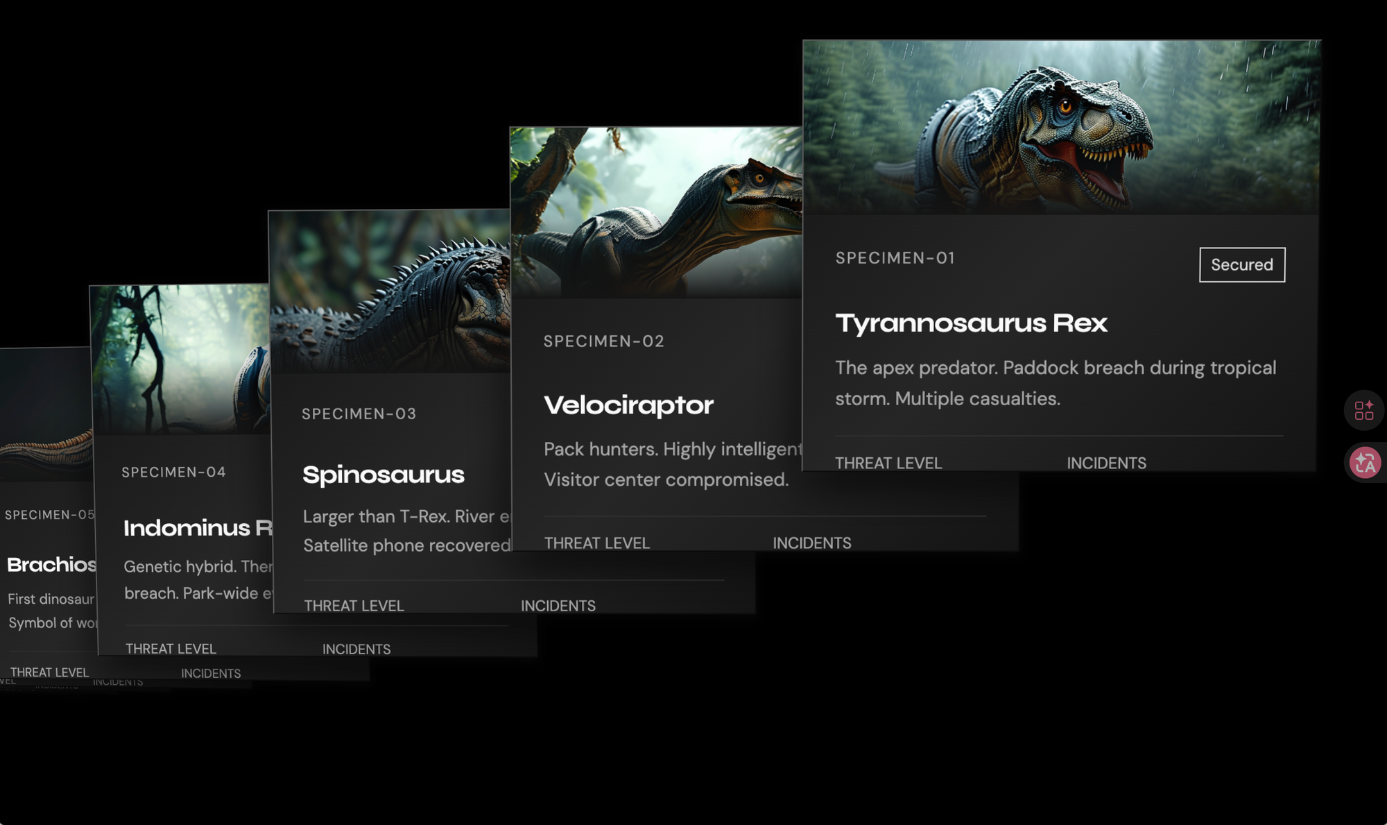
The generated interface uses a dark cinematic style with high-contrast images and a layered card layout to create depth and strong visual impact. Bold typography highlights key information, while smaller text builds a clear visual hierarchy. Overall, the design feels futuristic and narrative-driven, where the interface itself becomes part of the visual storytelling.
Neumorphic
Well suited for smart home interfaces, control panels, and interactive tools. Its defining feature is the use of soft shadows and subtle depth, making interactive elements feel more intuitive. The overall style feels gentle, tactile, and slightly premium, making it ideal for more touch-oriented experiences.
Prompt:
Design a premium glassmorphism schedule dashboard with a soft purple-blue gradient background and floating frosted glass cards for meetings, timelines, and events. Use clean Inter typography, minimal line icons, subtle hover animations, and a calm, responsive, futuristic layout.
Entered the prompt on the MeDo website and selected the "Neumorphic" style, as shown in the image below:
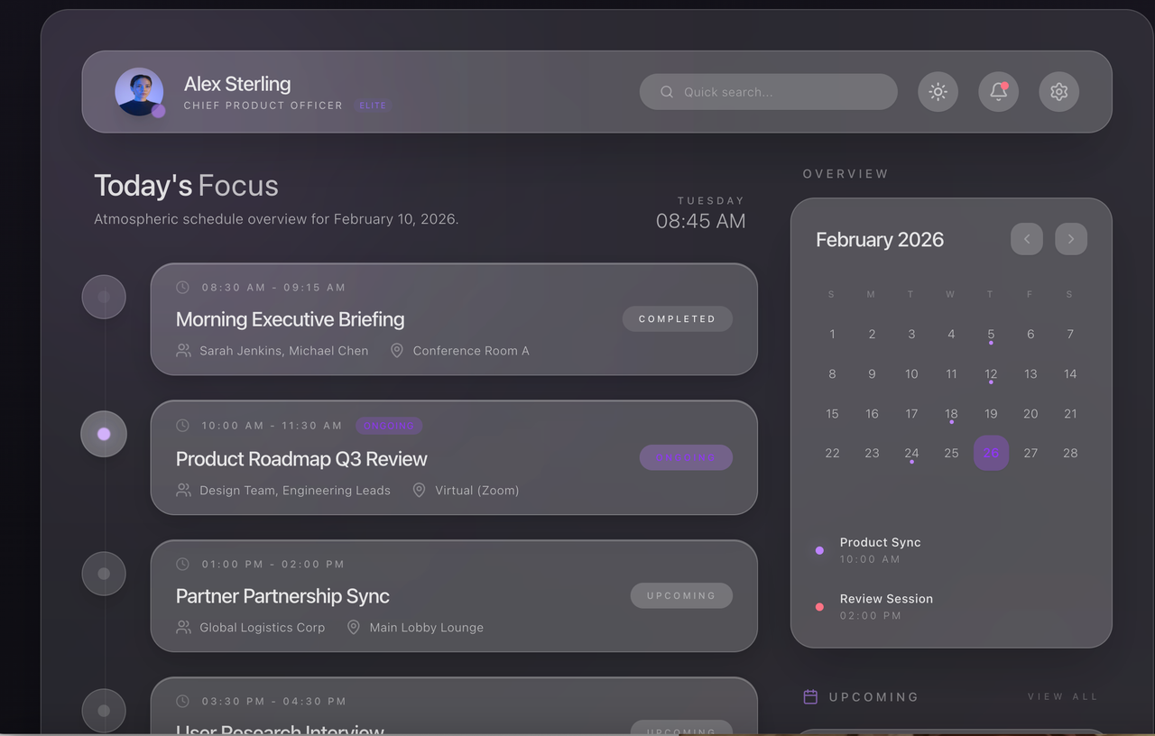
The generated interface presents a soft, futuristic dashboard aesthetic with translucent panels and subtle depth effects. Frosted glass cards, gentle gradients, and smooth shadows create a calm and premium atmosphere. The interface feels both modern and comfortable, making complex schedules easier to read.
Blueprint
Best for industrial systems, engineering platforms, and technical software. It conveys a strong sense of structure, precision, and technical clarity, often resembling blueprints or system diagrams. This style works particularly well for products that emphasize logic, process, and reliability.
Prompt:
Design an industrial equipment monitoring dashboard that displays machine status, production workflows, performance metrics, and alert systems. Use a blueprint-inspired visual style with grid lines, structured layouts, and technical line elements. The interface should feel precise, professional, and engineering-focused.
Entered the prompt on the MeDo website and selected the "Blueprint" style, as shown in the image below:
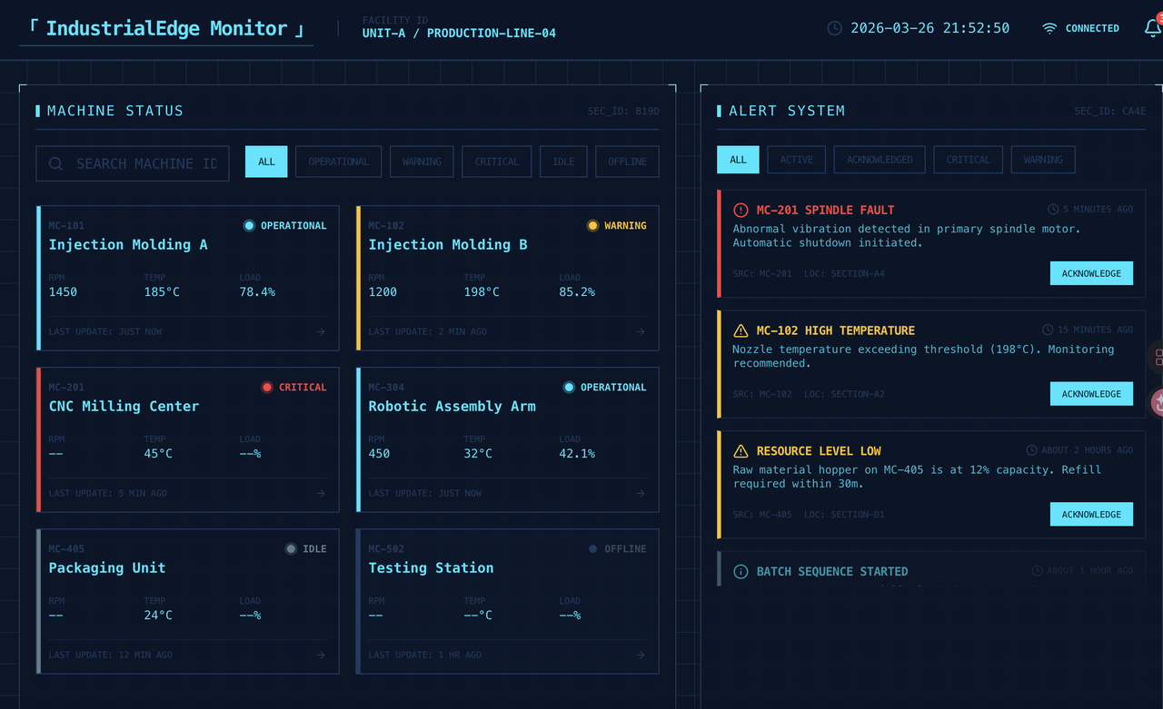
The generated interface resembles an industrial control system with a strong engineering aesthetic. The dark blue background, grid structures, and technical line elements reinforce a sense of precision and system logic. High-contrast status colors improve the visibility of alerts and machine data.
Creative & Branding UI
This group is best suited for brand websites, portfolios, marketing pages, and design-driven products.What they share is a stronger focus on expression, visual identity, and distinctive style.
Brutalism
Best for designer portfolios, experimental brands, trend-driven websites, and creative campaigns.Brutalism intentionally breaks conventional design rules, emphasizing raw, direct, and non-traditional visual expression. It creates a strong sense of attitude and individuality.This style is ideal for brands that want users to remember who they are, rather than blending into safe and generic designs.
Prompt:
Build a website that provides rich information about AI-related book recommendations. The site should include book titles, authors, cover images, and brief introductions for each book. It should also support search functionality, category filtering, and book sorting.
Entered the prompt on the MeDo website and selected the "Brutalism" style, as shown in the image below:
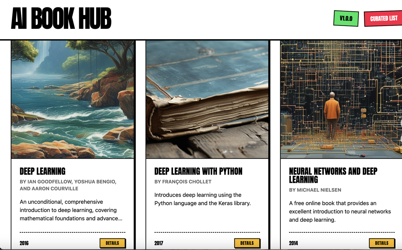
The generated interface uses high-contrast colors and bold typography, with a dark base and neon accents to create a strong visual impact. Text hierarchy is defined through size and weight, breaking traditional grid rules and emphasizing expression over structure. Rough edges and raw details enhance the overall attitude. This style is ideal for strong branding and creative expression, where the interface itself becomes part of the visual identity.
Editorial
Best for content platforms, blogs, brand websites, and media pages.Editorial prioritizes typography, layout, and reading flow, making the interface feel like a carefully curated digital magazine. It’s ideal for brands that want to convey taste, depth, and strong content presence.
Prompt:
Create a premium editorial-style survey landing page with a large serif headline on the left and clean info cards on the right. Include a black "Start Research" CTA button, thin divider lines, light gray cards, and subtle red accents. Use a minimal black-white color scheme and make it clean, professional, and responsive.
Entered the prompt on the MeDo website and selected the "Editorial" style, as shown in the image below:
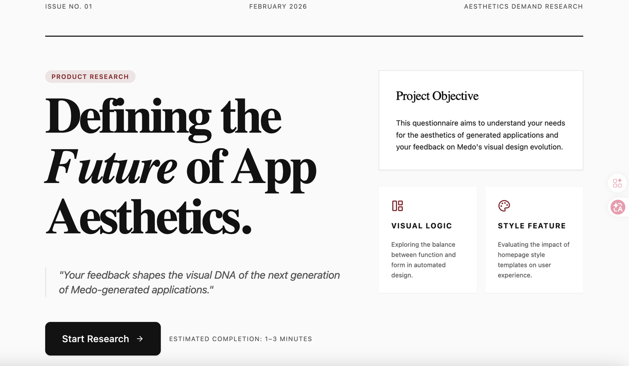
The generated interface successfully recreates the visual language of a high-end design magazine. Large serif typography, generous white space, and a strong editorial grid create a refined reading experience. The use of subtle dividers and muted accent colors enhances information hierarchy without distracting from the content.
Duotone
Best for photography portfolios, creative studios, and brand campaigns.By limiting the color palette, Duotone creates a strong and consistent visual identity. The style feels controlled and intentional, making it suitable for projects that value coherence and art direction.
Prompt:
Design a photography portfolio website that showcases featured works, categorized projects, and a personal bio. Apply a duotone color treatment across visuals to create a consistent and striking visual identity. Use contrast and tonal variation to add depth while maintaining a limited color palette.
Entered the prompt on the MeDo website and selected the "Duotone" style, as shown in the image below:
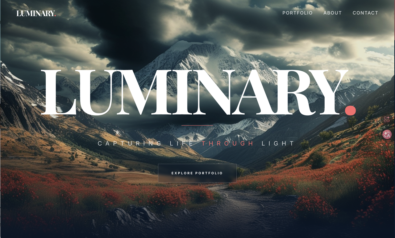
The generated interface creates a strong visual impact through dramatic imagery and controlled color contrast. The large typography and limited accent colors help maintain a clean and consistent visual identity. The main advantage of this style is its strong visual storytelling ability, allowing brands to quickly communicate mood and personality. This style is especially suitable for photography portfolios and creative brand websites.
De Stijl
Best for design studios, architecture firms, and concept-driven brands.It emphasizes geometric order, strong structure, and primary color blocks. The result is a rational, modern, and highly structured visual language, ideal for expressing design thinking and spatial aesthetics.
Prompt:
Design a design studio website homepage using a geometric grid layout. Incorporate primary colors (red, blue, yellow) and structured composition with strict alignment. Emphasize balance, order, and modernist design principles inspired by De Stijl.
Entered the prompt on the MeDo website and selected the "De Stijl" style, as shown in the image below:
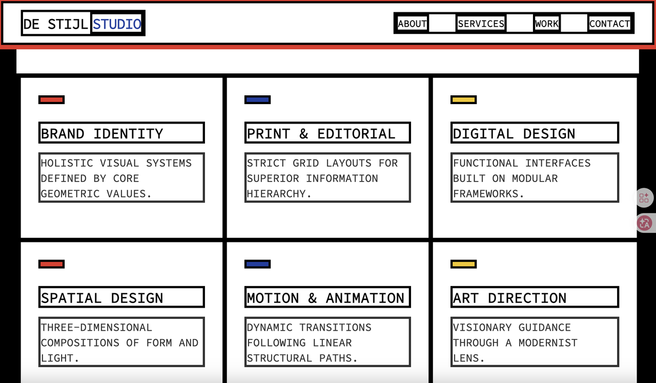
The generated interface reflects the principles of modernist design and geometric order. Strong grid structures, primary color accents, and strict alignment create a highly rational and structured visual language. The clear separation of content blocks improves readability while reinforcing the design philosophy behind the layout. The main advantage of this style is its strong sense of structure and clarity, making it ideal for design studios, architecture firms, and concept-driven brands.
Punchy
Best for campaign pages, sports brands, and promotional landing pages.Punchy relies on high contrast, strong rhythm, and bold headlines to create instant visual impact. It’s effective for grabbing attention quickly and driving engagement and conversion.
Prompt:
Design a sports brand campaign landing page that highlights new product releases, promotional content, and call-to-action sections. Use bold typography, high-contrast colors, and dynamic composition to create strong visual impact and energy.
Entered the prompt on the MeDo website and selected the "Punchy" style, as shown in the image below:
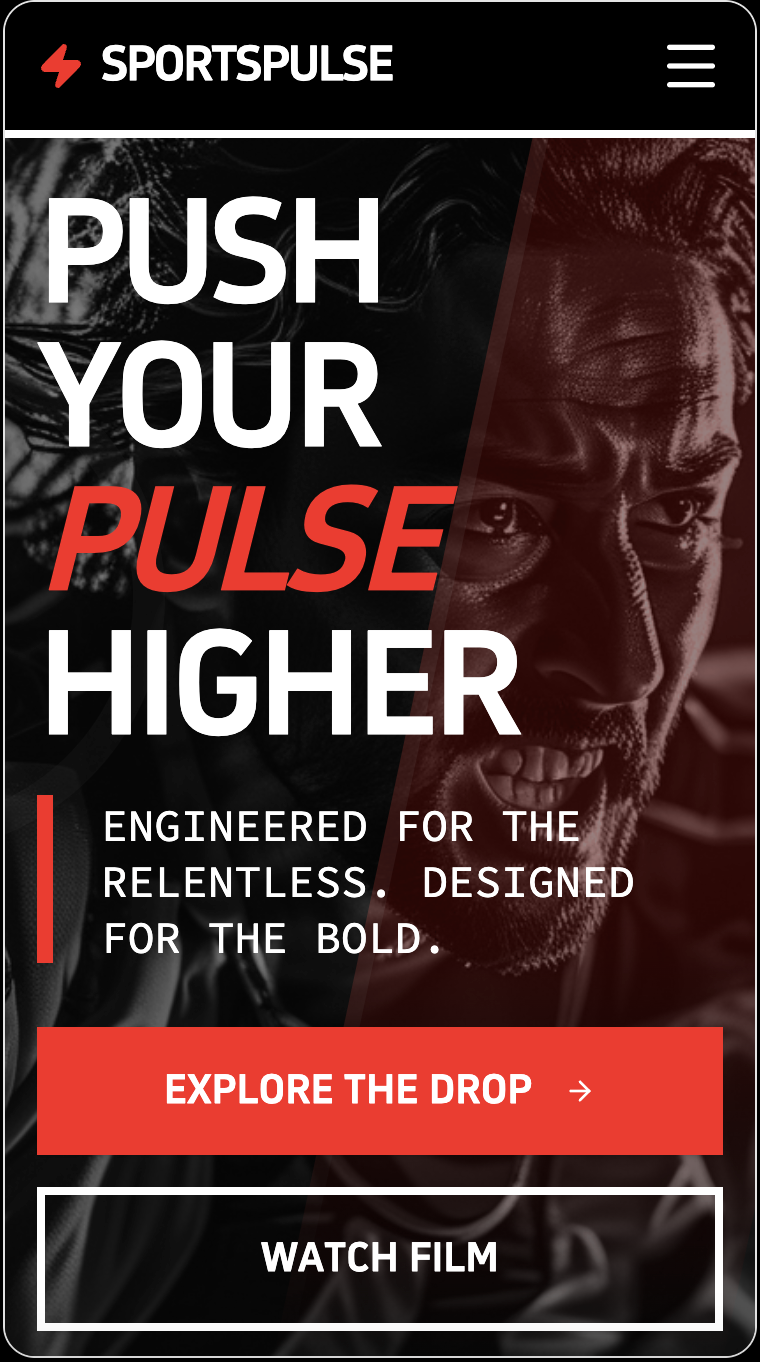
The generated interface delivers a strong sense of energy and impact through bold typography, high contrast colors, and dramatic composition. Large headlines and aggressive visual hierarchy immediately draw user attention and create a feeling of motion. The biggest strength of this style is its ability to capture attention instantly and communicate a strong brand attitude. It is especially effective for sports brands, campaign landing pages, and promotional marketing websites.
Opulent
Best for luxury brands, premium e-commerce, membership systems, and financial services.With dark backgrounds, metallic accents, and refined details, Opulent creates a sense of prestige and exclusivity. It works especially well for products positioned around quality, status, and high-end experience.
Prompt:
Build a website that show a brand that called "Rotin", it's a brand of High end watches, the website should contain the information of the watches and the information of that company.
Entered the prompt on the MeDo website and selected the "Opulent" style, as shown in the image below:
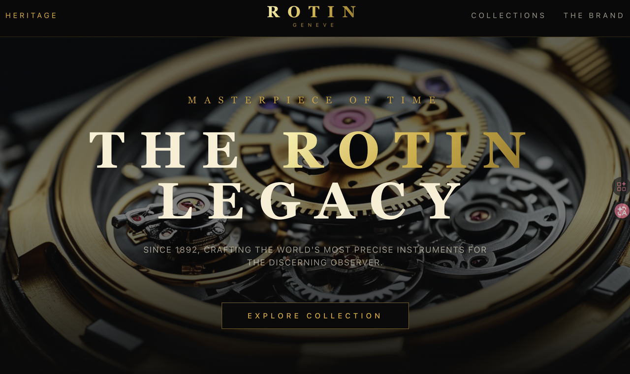
The generated interface conveys a strong luxury brand identity through dark backgrounds, gold typography, and high-quality imagery. The large hero visual and elegant serif fonts create a sense of prestige and exclusivity. Careful spacing and refined details reinforce premium positioning.
Emotional & Lifestyle UI
This group is best suited for beauty, wellness, lifestyle, and emotion-driven products.What they share is a stronger focus on atmosphere, feeling, and immersive experience.
Natural
Best suited for organic food, eco-friendly brands, healthy living, outdoor activities, and sustainability-focused products.It uses earth tones, natural textures, and organic shapes to create a look that feels authentic, healthy, and trustworthy. This style is especially effective for products that want to communicate a sense of nature, purity, and lightness.
Prompt:
Design a product detail page for an organic food e-commerce website, including product origin, farming process, nutritional information, and user reviews. Use earthy tones such as green and brown, along with organic shapes and natural textures to convey sustainability and trust.
Entered the prompt on the MeDo website and selected the "Natural" style, as shown in the image below:
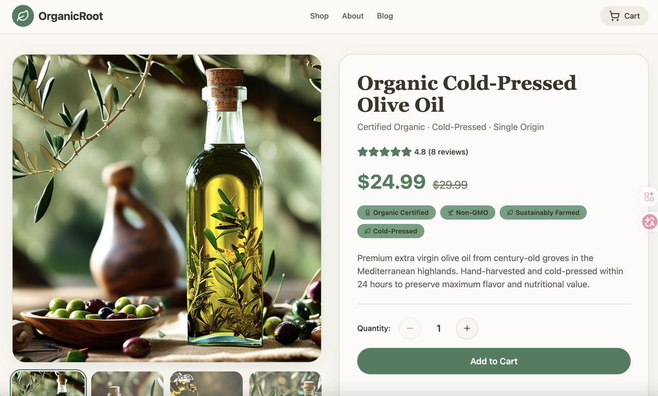
The generated interface uses soft natural colors, mainly green and beige, creating a warm and trustworthy feel. A clear hierarchy and card-based layout improve readability, while rounded elements and subtle shadows enhance comfort. This style works especially well for e-commerce and lifestyle products, conveying a sense of quality and health.
Macaron
Best for beauty, skincare, female-oriented products, and lifestyle brands.Macaron is defined by its soft, light, and friendly visual tone, creating an immediate sense of ease. It works especially well for brands that want to convey gentleness, comfort, and approachability.
Prompt:
I need a full-stack website for a beauty clinic and salon named “Reshap by Rasha.”
The site must include front-end, back-end, and database functionality for real-time bookings, admin control, and payment tracking.
Entered the prompt on the MeDo website and selected the "Neumorphic" style, as shown in the image below:
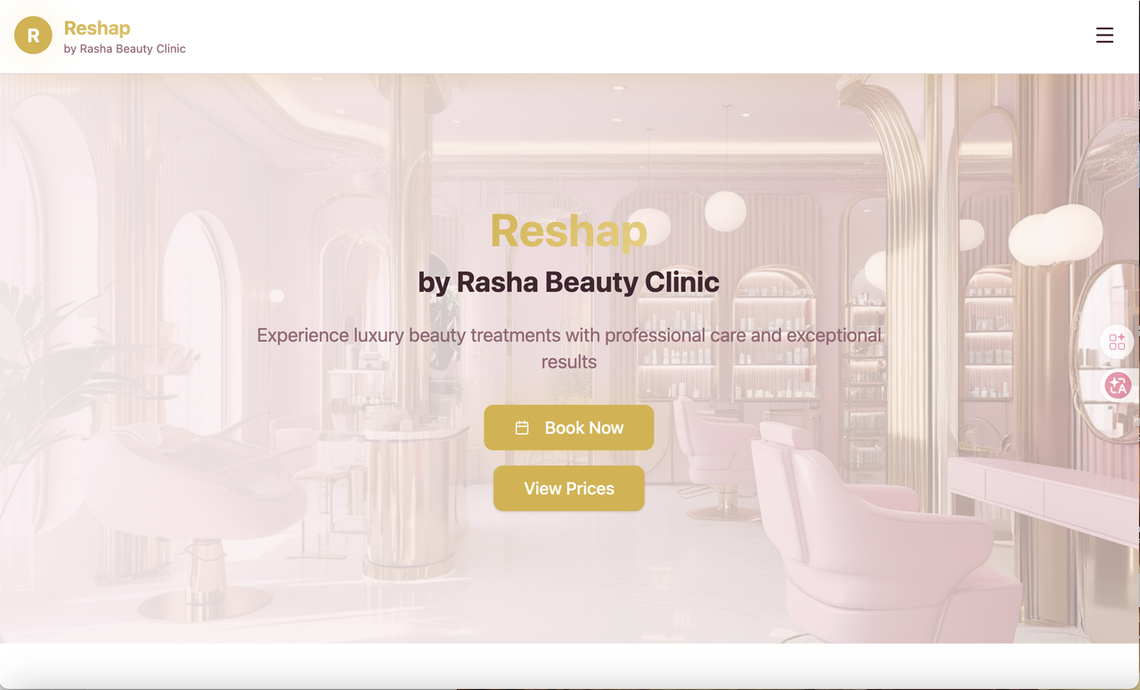
The generated interface uses soft pastel colors, warm lighting, and rounded visual elements to create a gentle and welcoming atmosphere. The combination of elegant typography and soft overlays gives the interface a premium yet approachable feeling. The biggest advantage of this style is its ability to communicate comfort, trust, and lifestyle quality.
Mystical
Best for tarot, astrology, spiritual growth, and fantasy-themed products.It uses dark tones, glowing elements, and symbolic visuals to create a highly immersive and ritual-like atmosphere. More than just a UI style, it expresses a strong sense of emotion and world-building.
Prompt:
Design a tarot reading web app interface that includes card spreads, interpretation results, and daily horoscope insights. Use a dark background with glowing elements and symbolic visuals to create a mysterious and immersive atmosphere.
Entered the prompt on the MeDo website and selected the "Mystical" style, as shown in the image below:
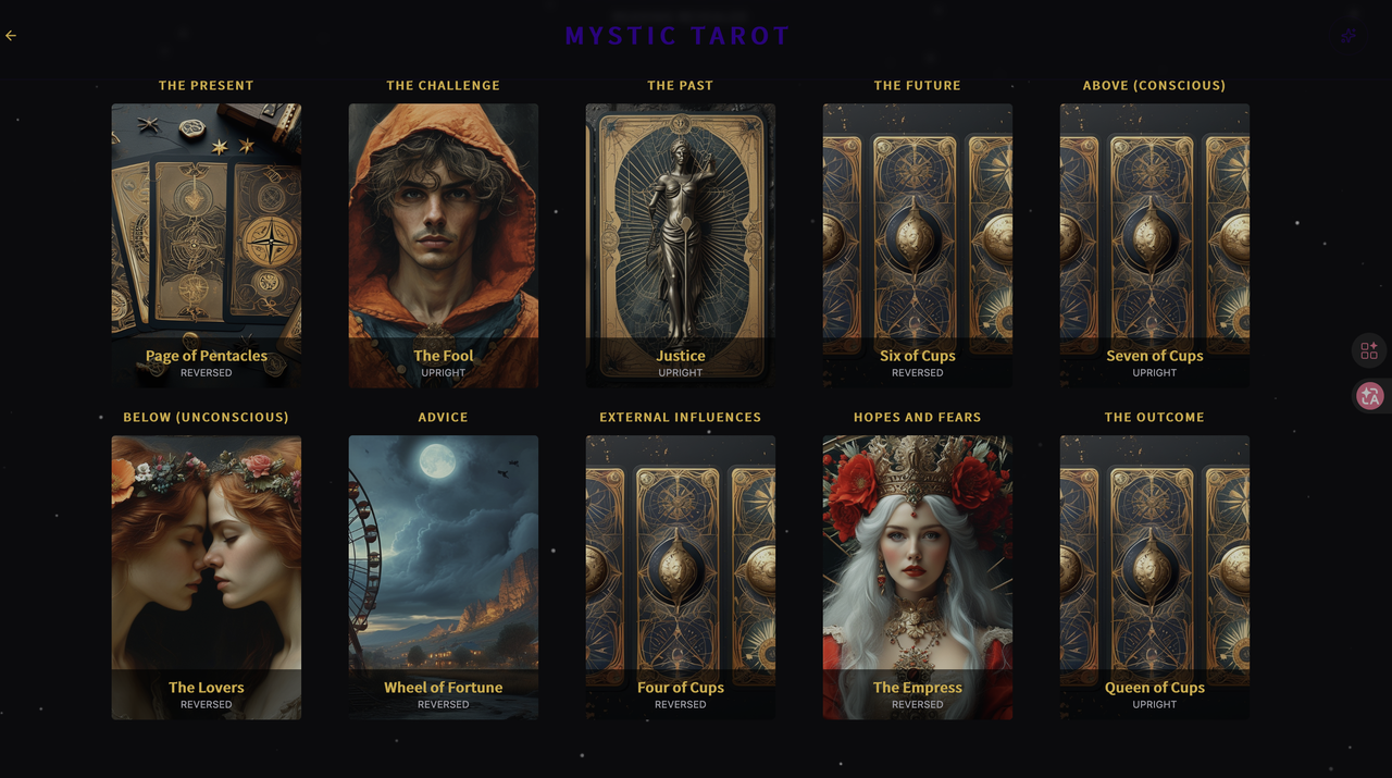
The generated interface builds a strong sense of mystery and immersion through dark tones, glowing accents, and symbolic imagery. The layout feels more like an experience than a traditional interface. Rich visuals and dramatic contrast strengthen the emotional storytelling.
Luminate
Best for tech launches, product onboarding, achievement systems, and innovation showcases.Through light effects and glowing elements, it creates a sense of activation and energy. The overall tone feels futuristic, optimistic, and full of momentum, making it ideal for technology-driven products.
Prompt:
Design a sports brand campaign landing page that highlights new product releases, promotional content, and call-to-action sections. Use bold typography, high-contrast colors, and dynamic composition to create strong visual impact and energy.
Entered the prompt on the MeDo website and selected the "Luminate" style, as shown in the image below:
The generated interface creates a strong sense of visual drama and cinematic storytelling through large typography and immersive background imagery. The use of lighting contrast and atmospheric visuals makes the interface feel premium and emotionally engaging. This style’s strength lies in its ability to create a strong first impression and communicate brand personality quickly. It is particularly suitable for portfolio websites, creative studios, and brand showcase platforms.
Niche & Thematic UI
This group leans toward more thematic styles, designed for specific audiences and use cases.What they share is strong distinctiveness. When chosen correctly, they become highly memorable.
Notebook
Best suited for journaling apps, note-taking tools, writing platforms, and personal tracking products.It makes the interface feel like a real notebook rather than a cold software system. This style emphasizes personal, handcrafted, and emotional connection, helping users feel more relaxed and engaged.
Prompt:
Design a personal journaling web app interface that includes date labels, mood tracking, text input, and image insertion. Use a handwritten aesthetic with paper textures, notebook layouts, and subtle imperfections to create a warm and personal experience. Style: Notebook.
Entered the prompt on the MeDo website and selected the "Notebook" style, as shown in the image below:
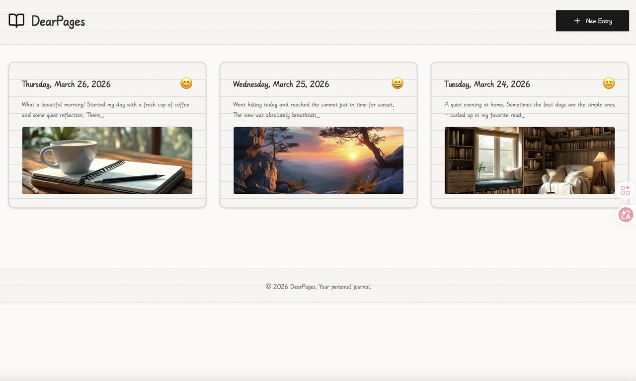
The generated interface recreates a notebook-like experience, using a light paper background, handwritten-style fonts, and subtle dividers to create a personal and relaxed atmosphere. Each entry feels like an individual page, adding emotion and storytelling to the content. The layout flows naturally, making it ideal for journaling and personal expression, while encouraging stronger emotional connection.
Terminal
Best suited for developer tools, server monitoring, system dashboards, and tech-focused products.It mimics the command-line interface, creating a strong sense of familiarity and credibility for technical users. This style is ideal for products that emphasize efficiency, real-time data, and system-level visibility.
Prompt:
Create a TradingView-based forex trading dashboard with a live chart widget displaying major forex pairs (EUR/USD, GBP/USD, GBP/JPY, USD/JPY, etc.). Include a Kolkata current time display, a 1-minute candle timeframe with a countdown timer, and visual indicators for the next two predicted candles based on technical indicators. The interface should be clean and professional, focused on real-time market monitoring and analysis.
Entered the prompt on the MeDo website and selected the "Terminal" style, as shown in the image below:
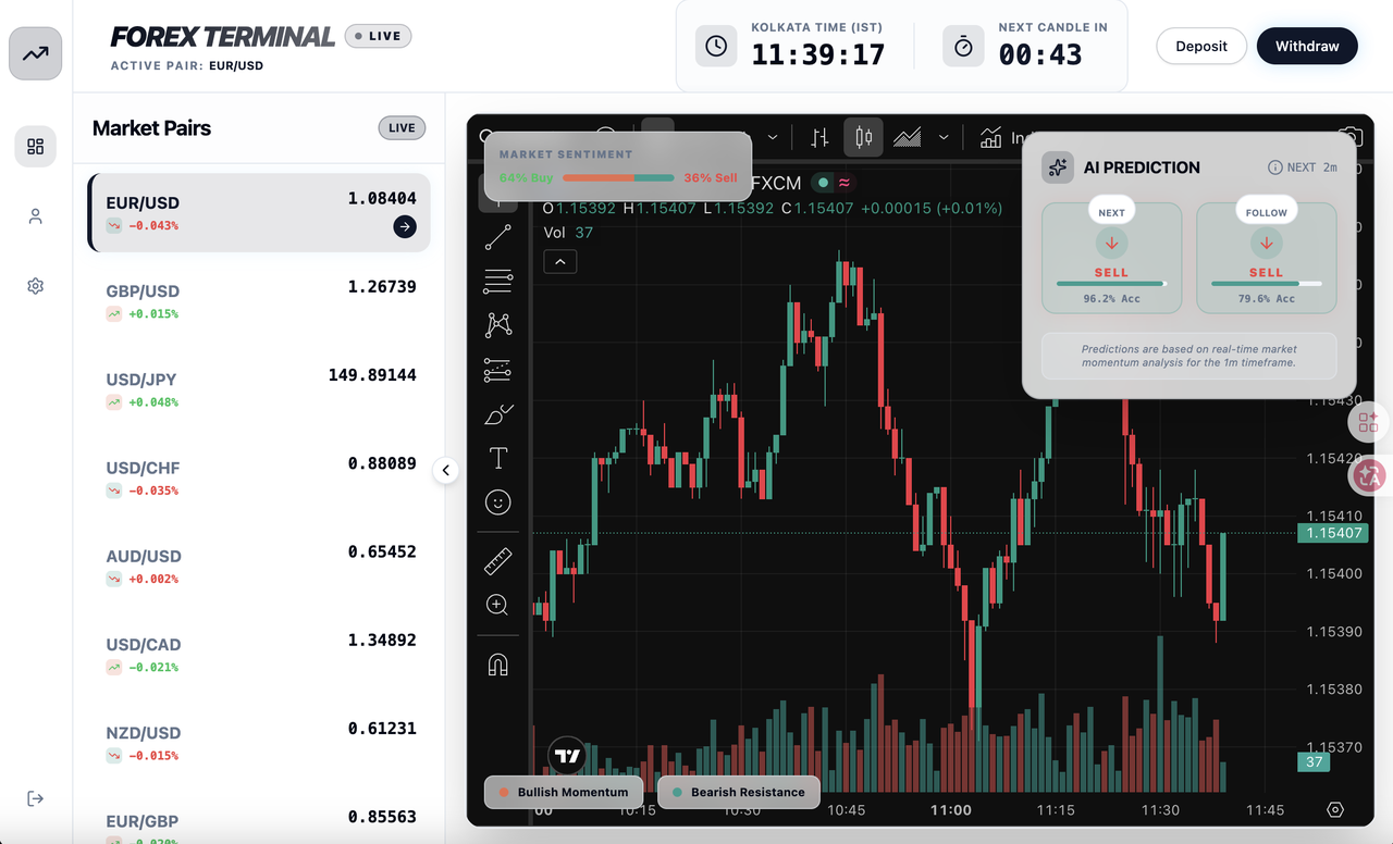
The generated interface resembles a professional trading workstation with real-time charts and structured information panels. Dark backgrounds combined with high-contrast data elements improve focus during long usage sessions. Clear separation between market data and prediction panels supports fast decision making.
Pixel
Best for retro games, nostalgic campaigns, and playful, youth-oriented products.Pixel style evokes a strong sense of nostalgia and gaming culture, making it highly memorable. It’s not just retro, but a clear cultural symbol that helps build strong visual identity.
Prompt:
Design a retro arcade-style game main interface that includes player stats, level progression, score display, and a reward or item shop. Use pixelated graphics, 8-bit icons, and nostalgic color palettes to recreate a classic arcade gaming experience.
Entered the prompt on the MeDo website and selected the "Pixel" style, as shown in the image below:
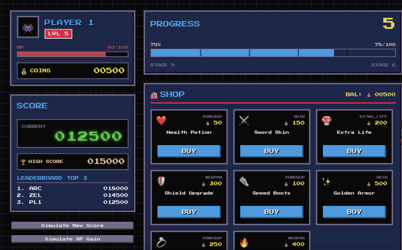
The generated interface perfectly recreates the visual language of classic 1980s arcade games. Pixelated icons, retro color palettes, and blocky UI elements all contribute to a strong nostalgic atmosphere. Even the buttons and score panels resemble traditional game HUD designs. The biggest advantage of this style is its instant recognizability, allowing users to immediately associate the product with retro gaming culture.
Conclusion
AI has made building an app easier than ever.But what truly determines whether a product can move forward is not functionality. It is whether the interface feels like a real product.The value of MeDo UI Enhancer lies in solving this problem early. It doesn’t replace designers. It helps non-designers start from the right visual foundation.Because in many cases, what makes a product taken seriously is not the code, but the first impression of the interface.Choose the right UI style, and AI-generated apps finally begin to feel like real products.