
Image + Fallback
 MD
MD
MDPhoto, illustrated avatar, or initials when the image 404s.
View Prompt
BasicImage + Fallback
Photo when it loads, initials when it doesn't. The avatar every app needs first.
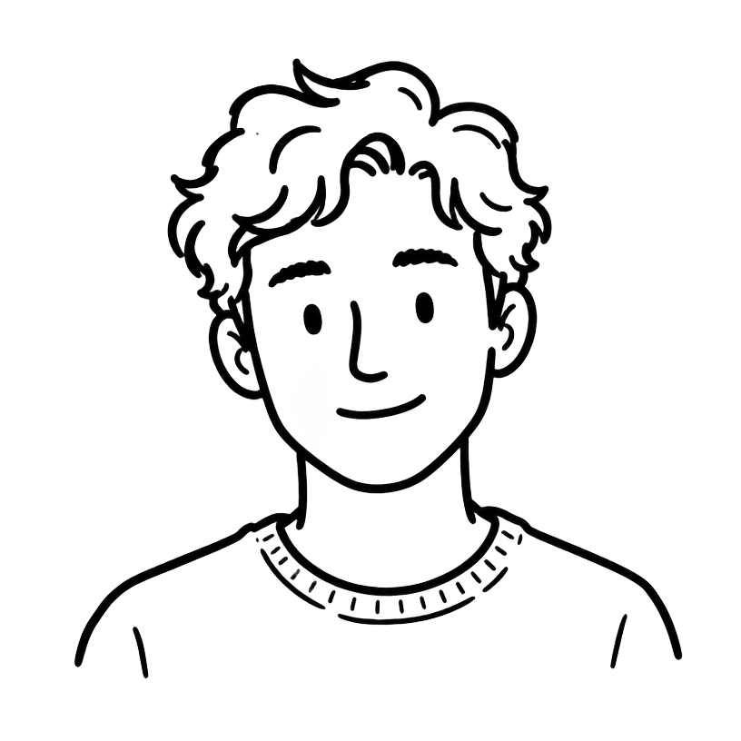
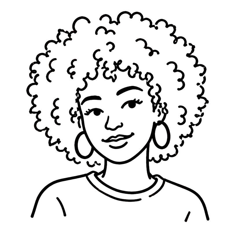
Browse 6 avatar patterns — photo, Notion-style illustrated, initials fallback, presence badge, stacked group and uploader. Copy a Tailwind + shadcn-oriented prompt, then open MeDo or your preferred AI editor to build it.
MDPhoto, illustrated avatar, or initials when the image 404s.
Online Away
Away
 +12
+1216 collaborators on Q3 Launch

Start with a proven prompt
Real React + Tailwind previews. Click any template to see the exact prompt that generates it.
MDPhoto, illustrated avatar, or initials when the image 404s.
Photo when it loads, initials when it doesn't. The avatar every app needs first.
OnlineAwayOnline, away, busy, offline — a presence dot anchored to the avatar's edge.
+1216 collaborators on Q3 Launch
Overlapping avatar stack with a +N overflow chip. For teams, assignees, collaborators.
xs through xl on one type scale, plus circle, squircle and rounded-square variants.
Avatar with a camera badge, upload button and file constraints. For settings pages.
Avatar, name, verification tick and role — the row that fills tables and member lists.
From SaaS team settings to chat inboxes — six avatar patterns tuned to where they actually ship.
01 / 06
Member lists live and die by the avatar row — photo, name, role, access action. Initials fallback keeps the table tidy when nobody has uploaded a photo yet.
02 / 06
Stacked avatars with a +N chip show who else is in the document. The most compact way to signal presence without a sidebar.
+1216 collaborators on Q3 Launch
03 / 06
A presence dot pinned to the avatar edge answers "can I message them right now" before the user opens a thread.
OnlineAway04 / 06
Reviewer avatar plus a verification tick raises perceived trust on product pages far more than a star rating alone.
05 / 06
One avatar primitive, six sizes. The same component serves a 20px table cell and a 96px profile header without a second implementation.
06 / 06
The upload avatar is the first thing a new user personalises. Validation, preview and remove all handled client-side.
Initials fallback, presence badge, stacked group, size scale, uploader, profile row — pick the variant your surface needs.
01 / 06
Image with an initials fallback and a deterministic background color per name. The baseline every other variant extends.
MDPhoto, illustrated avatar, or initials when the image 404s.
02 / 06
Online, away, busy, offline. Color plus a visually hidden label so presence never depends on color alone.
OnlineAway03 / 06
Overlapping stack, ringed edges, and a +N overflow chip after the max visible count. Hover lifts the active member.
+1216 collaborators on Q3 Launch
04 / 06
xs to 2xl on one lookup table, with circle, squircle and rounded-square shapes. Retheme the whole scale in one object.
05 / 06
Camera badge, hidden file input, type and size validation, local preview and remove. Ready for a settings page.
06 / 06
Avatar, name, verification tick and role line — the compact row that fills tables and member lists.
React, Next.js, TanStack Start, Vue 3, SvelteKit, or plain HTML — the same avatar, six ways to drop it in.
Team lists, collaboration presence, social feeds, support inboxes, onboarding and marketplace reviews.
Settings pages, org charts and permission tables all need the same row: avatar, name, role, action. Choose a pattern once and reuse it across every table in the app.
Stacked avatars with a +N chip are the cheapest presence UI there is — one row tells the user who else is editing without a sidebar or a websocket dashboard.
Comment threads, reactions and mentions repeat the avatar hundreds of times per page. A single primitive with a size scale keeps the layout consistent and the bundle small.
Presence badges tell an agent whether a customer is still online, and the initials fallback keeps the inbox readable when nobody has a profile photo.
The uploader preview shows the intended profile-photo layout and the file constraints a production implementation should handle.
Reviewer avatars with a verification tick do more for perceived trust than an extra star. Drop the profile row straight into product pages.
Four steps, from browsing the gallery to shipping the avatar in your production components.
Scan the 6 templates above and pick the one closest to your surface — photo, illustrated, table row, presence stack, or upload control. (~30s)
Every card renders a real React + Tailwind preview, so you see the spacing and sizing before you copy anything. (~2s)
Copy the prompt into MeDo, Lovable, Bolt, v0 or Cursor. The gallery provides a brief and visual preview rather than a downloadable code file. (~10s)
Open MeDo with the copied prompt, then adapt the resulting component for tables, headers and comment threads. (~1min)
Choose a template, copy its prompt, then open MeDo to turn it into a working product with the main app's real generation flow.