
Clarity, Then Beauty
Content is the interface first. Apple pages let alignment, whitespace and type hierarchy do the work before any ornament arrives. The result feels premium because nothing competes with the message.
Use a page brief with the calm of an Apple product launch: one oversized headline per screen, a grayscale palette with a single accent, generous whitespace and quiet scroll motion. Copy the prompt, then open MeDo to build it.
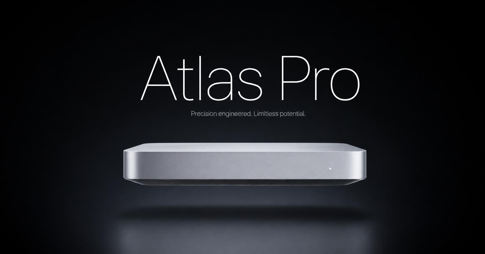
Start with a proven prompt
Colors, type scale, button variants, layout rhythm and motion — read as tokens, then copy the whole DESIGN.md.
01 — Color Palette
One blue does every interactive moment. Surfaces alternate white, off-white and near-black. No gradients anywhere.
Brand & Accent
primary (Action Blue)
#0071e3
Every interactive element — links and pill CTAs.
primary-deep
#0066cc
Inline body links and hover state.
primary-on-dark
#2997ff
Links and CTAs on dark tiles.
Surface
canvas
#ffffff
Default page surface.
canvas-wash
#f5f5f7
The signature off-white — footers and alternating tiles.
surface-pearl
#fafafc
Capsule button fill and quiet cards.
surface-tile
#1d1d1f
Primary dark tile.
surface-black
#000000
True void — global nav and video sections.
Text & Hairlines
ink
#1d1d1f
All headlines and body copy on light surfaces.
ink-muted
#6e6e73
Secondary copy and lead paragraphs.
ink-subtle
#86868b
Captions, fine print, disabled labels.
body-on-dark
#cccccc
Secondary copy on dark tiles.
hairline
#d2d2d7
1px borders, spec table dividers.
divider-soft
#f0f0f0
Soft ring under capsule buttons.
Apple's website language is a system of restraint: a grayscale canvas, one reserved accent color, oversized headlines with tight tracking, and one idea per full-height panel. These principles come from Apple's Human Interface Guidelines and the live apple.com experience — not from copying any single product page.
Content is the interface first. Apple pages let alignment, whitespace and type hierarchy do the work before any ornament arrives. The result feels premium because nothing competes with the message.
Each full-height panel carries a single claim, one supporting sentence and one product image. The scroll slows the reader down so the argument lands, instead of scattering attention across five bullet points.
Depth comes from translucent layers, backdrop blur and hairline dividers — not shadows, gradients or borders. Blue is reserved for the one action a screen wants you to take; everything else lives in grayscale.
The style rewards pages with one thing to say per screen — describe your own pages in a focused prompt.
The style was built for physical objects. One product, one hero shot, one claim per scroll — then a specs table for buyers who need the numbers before they commit.
A dark canvas, an oversized headline and a single glowing app window outperform a five-column feature grid on launch day. Ship the page in an afternoon instead of a sprint.
Describe the structure of your current landing page in a prompt, then ask MeDo to rebuild it on the Apple-style typography and spacing scale.
Whitespace flatters work. Full-bleed project images with quiet captions let a portfolio read as considered rather than crowded.
Countdown, one date, one line of copy, one register action. The restraint reads as confidence, which is exactly what an event page is selling.
Hand a new team the exported tokens — type scale, grays, spacing steps — so every page they build after lands in the same visual language without a review cycle.
From a style brief to a working page in MeDo in about four steps.
Describe the page you want and the structure you need, then copy the brief into MeDo. (~15s)
Use the prompt to specify the layout skeleton — nav, hero, feature sections, specs and footer — with your own copy, images and logos. (~30s)
Your page is rebuilt on the typography scale, grayscale palette, whitespace rhythm and reveal motion documented above. (~1min)
Open MeDo with the copied brief and continue the real build there. (~2min)
Same tokens-first approach, different visual language.
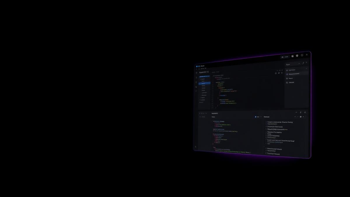
Near-black canvas, sharp small type, gradient glow, tight product grid. For infra and dev tools.
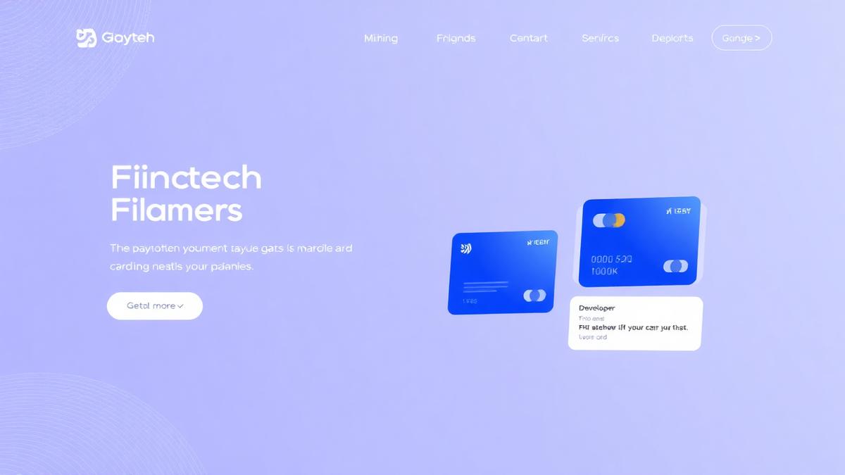
Slate navy hero, angled mesh gradient, floating card UI and inline code blocks. For payments and API-first products.
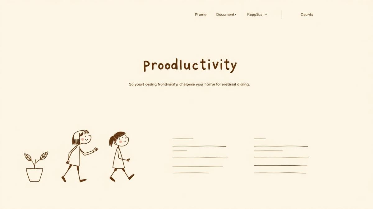
Cream canvas, serif marketing headlines, pastel tag tints and a 708px document measure. For docs and notes.
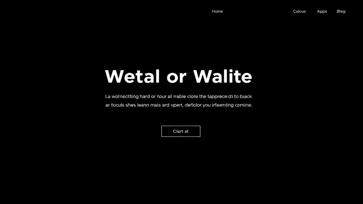
Pure black, geometric sans, monospace labels, terminal panels. For deploy and platform products.
Copy an Apple-style prompt, then open MeDo to build the page with the main app's real generation flow.
Disclaimer: MeDo is an independent product and is not affiliated with, endorsed by or sponsored by Apple Inc. “Apple-style” here describes a general design approach — typography scale, spacing rhythm and grayscale palette. All previews on this page use the fictional brand “Atlas” and contain no Apple trademarks, product names or assets. Do not reproduce another company’s trademarks, imagery or marketing copy in pages you publish.