
A Document, Not a Landing Page
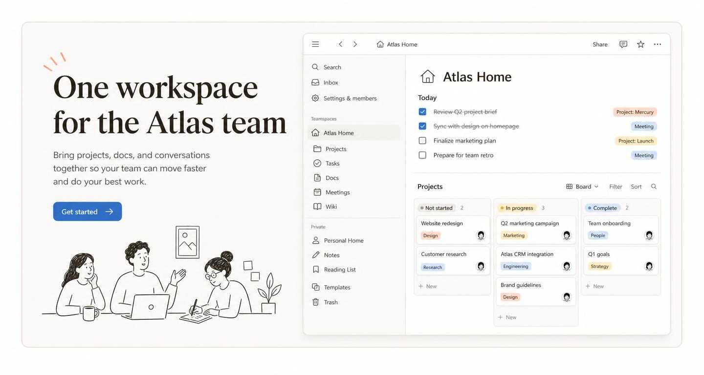
Text narrows to a 708px measure, headings sit in sentence case and paragraphs run at 16px with 1.5 line height. Visitors read the page the way they read a doc — which is exactly the product being sold.
Use a page brief that reads like a well-kept document: a cream canvas, warm near-black ink, serif marketing headlines over a plain sans UI, pastel tag tints and a 708px reading measure. Copy the prompt, then open MeDo to build it.
Start with a proven prompt
Colors, type scale, button variants, layout rhythm and motion — read as tokens, then copy the whole DESIGN.md.
01 — Color Palette
Nothing is pure: the canvas is cream, the ink is warm near-black, and color arrives only as soft tag tints. One blue does buttons and links.
Brand & Accent
primary (Notion Blue)
#2383e2
Primary buttons and inline links.
primary-hover
#1a6dbd
Hover state on the primary button.
accent-terracotta
#d9730d
Illustration ink and callout accents.
Surface
canvas
#ffffff
App windows, cards and the docs body.
canvas-warm
#f7f6f3
The signature warm off-white behind every marketing section.
surface-hover
#efefee
Row hover, sidebar selection, ghost button hover.
surface-ink
#191919
Dark footer and screenshot chrome.
Tag Tints
tint-peach
#ffe2dd
Tag and callout background — red family.
tint-butter
#fbf3db
Tag and callout background — yellow family.
tint-sky
#e7f3f8
Tag and callout background — blue family.
tint-sage
#edf3ec
Tag and callout background — green family.
Text & Hairlines
ink
#37352f
All headlines and body copy — warm near-black, never #000.
ink-muted
#787774
Secondary copy, property labels, breadcrumbs.
ink-subtle
#9b9a97
Placeholders and empty states.
body-on-dark
#d4d4d2
Footer copy on the ink surface.
hairline
#e9e9e7
1px dividers, table grid, card borders.
Notion's website language treats the page as a document: warm neutrals instead of pure black and white, a display serif for marketing voice, a plain sans for the product, and color used only as soft tag tints. These principles come from publicly observable patterns on notion.so — not from copying any single page.
Text narrows to a 708px measure, headings sit in sentence case and paragraphs run at 16px with 1.5 line height. Visitors read the page the way they read a doc — which is exactly the product being sold.
Nothing is pure: the canvas is cream, the ink is a warm near-black, and color arrives only as soft pastel tag tints. The palette feels like paper and lowers the temperature of a dense page.
Radii are 4px, borders are single hairlines, and most controls announce themselves only with a 20ms hover fill. Illustration carries all the personality so the UI can stay silent.
The style rewards products where reading is the job — describe your own pages in a focused prompt.
The style was made for text products. A serif headline, a cream canvas and one screenshot of a real document say more about the app than a feature grid ever will.
A hairline sidebar, a 708px reading column and pastel callouts make long reference content approachable — and the near-square radii keep it looking official.
Three columns, 24px gaps, 4px card radii and a tint tag per category. The layout is quiet enough that dozens of thumbnails do not turn into noise.
Warm neutrals and a document measure read as trustworthy internal writing rather than marketing. Ideal for onboarding portals and company handbooks.
Describe the structure of your current page in a prompt, then ask MeDo to rebuild it on the Notion-style palette and measure.
Serif display type over cream, inline monospace for code and one blue for links. It is the shortest path to a site that is pleasant to read for ten minutes.
From a style brief to a working page in MeDo in about four steps.
Describe the docs site, wiki or productivity page you want, then copy the brief into MeDo. (~15s)
Use the prompt to specify the layout skeleton — nav, hero, feature bands, template grid and footer — with your own copy, images and logos. (~30s)
Your page is rebuilt on the cream canvas, warm ink, serif display type, pastel tints and 708px measure documented above. (~1min)
Open MeDo with the copied brief and continue the real build there. (~2min)
Same tokens-first approach, different visual language.
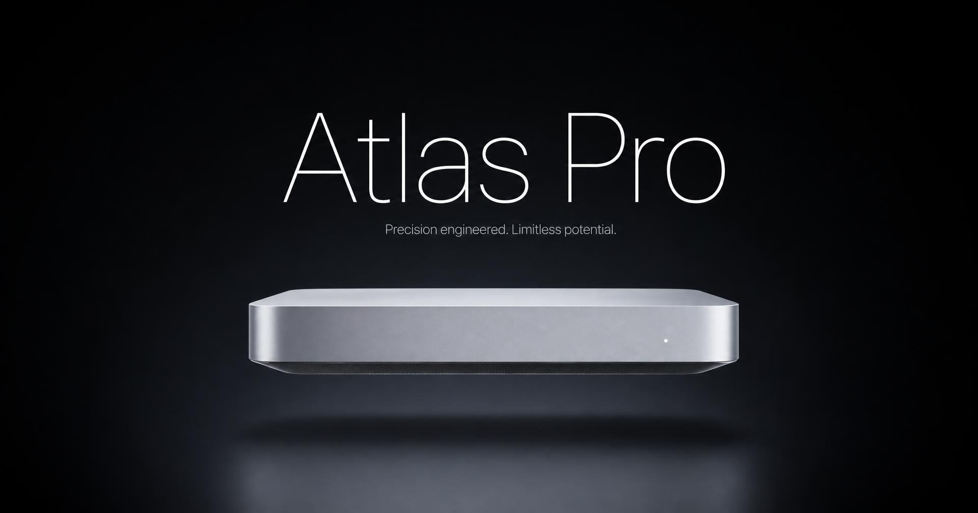
Oversized display type, grayscale palette with one accent, huge whitespace and quiet scroll reveals.
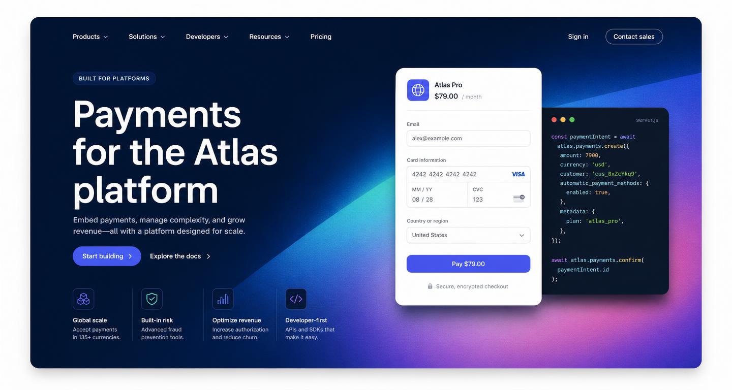
Slate navy hero, angled mesh gradient, floating card UI and code panels treated as hero content.
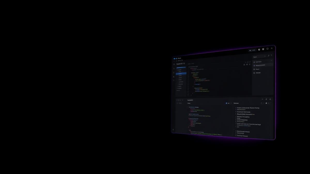
Near-black canvas, sharp small type, gradient glow, tight product grid. For infra and dev tools.
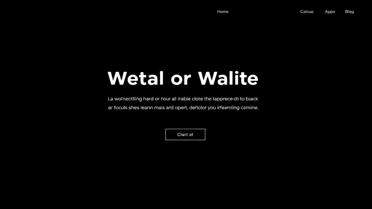
Pure black, geometric sans, monospace labels, terminal panels. For deploy and platform products.
Copy a Notion-style prompt, then open MeDo to build the page with the main app's real generation flow.
Disclaimer: MeDo is an independent product and is not affiliated with, endorsed by or sponsored by Notion Labs, Inc. “Notion-style” here describes a general design approach — palette direction, spacing rhythm and typographic scale. All previews on this page use the fictional brand “Atlas” and contain no Notion trademarks, product names or assets. Do not reproduce another company’s trademarks, imagery or marketing copy in pages you publish.